1. The Unique Selling Proposition (USP)
The primary point of a marketing campaign revolves around defining: What makes my brand special?
Usually, this has already been defined at a higher brand level using by expressing your companies core values, vision, and the value of your products and services. All you just need to do is restate it in a succinct way on your landing page.
Try to break down your offering to its most basic level, to describe the specific benefit your customers will get by choosing your product/service.
Set clear expectations for your customers and allows them to understand why they should care. On your landing page, the USP should be delivered using a combination of the following page elements:
-
The primary headline – be punchy, witty, attention grabbing, but not phony
-
Sub header – to clarify the headline
Example of N5R's Landing Page

2. The Benefits
After your USP has been stated, you should compose a detailed description of your product or services benefits or features.
The primary headline grabbed the customer’s attention, and now they will inquire more. They want to know “What’s in it for me?” State a clear benefit for your customer.
Don’t divulge too much information, just enough to satisfy a general inquiry. The point of a landing page is to get customers to fill out the form – not read for 10 minutes. Keep the benefits concise. Summarize the benefits in a single paragraph with up to 5 bullet points to clarify.
3. The Money Shot
The money shot is the visual representation of your offer, product, or service and can help people to gain a better understanding of what it is or what it looks like. It will most commonly be one of these types of visual element:
-
A photograph of your product/service – preferably shown in its context of use
-
A diagram illustrating how it fits into the realm of an existing problem (like a series of steps)
-
A chart comparing it to the competition
-
A large graphic simply stating the numerical aspect of the offer – 50% Bonus, FREE, $200 off etc.
4. Context of Use
Use a visual representation of people enjoying the benefits of your product or service in real life.This encourages your customers to empathize and imagine themselves enjoying the rewards of your product or service.
This can be achieved by:
-
A photo: Use a photo of people enjoying the benefits of your product or service.
-
Video: Video tutorials are a great way of demonstrating the effectiveness of your product or service.
-
Testimonials: People always look to what others are doing before a purchase. Use testimonials to let visitors know that you have had a history of happy clients/customers.
-
Client lists: List known brand names that are using your service provides an implied sense of context and adds to the feeling of trust.
5. Request for data
The main purpose of your landing page to be lead generation. Usually this will involve asking the visitor for their Name and Email in exchange for some sort of freebie (coupons, eBooks, etc.) If you are requesting data from your customers, keep the form as short as possible and include a privacy statement near the button or email address field.
6. The Backup Plan
Many visitors will not immediately become paying customers. Most of the time people will take the time to research or get cozy with your brand before they commit to a purchase. Don’t make the landing page a dead end. Give the visitor an opportunity to be redirected to begin a social media based relationship with your brand until they are ready to purchase.
Examples include:
-
Follow us and Like us: Using social media icon, which allow visitors the option of getting comfy with your brand.
-
Remind Me: Provide a way for them to be reminded (via email) at a predetermined time in the future (1 day, 1 week, 1 month, specific date etc.) and be sure to place a trust statement beside it that explicitly states that you will not contact them at any other time.
-
A Free Takeaway: Provide a link to a free download-able brochure (without having to complete a form).
-
Bookmark This Page: Enable visitors to find you again if they want to deal with you later on – especially important for standalone landing pages that are reached via an Ad they may never see again.
7. The Call to Action (CTA)
It is mission critical that your landing page has a Call To Action (CTA). All of the steps above culminate to the fundamental idea of getting your customers to act. A common CTA involves using a button on a form or a large clickable graphic that guides the visitor to the strategic areas of the website.
It’s important that the CTA gives the visitor very clear instruction on what clicking that button will do for them.
A CTA is kind of like a virtual handshake. CLICK HERE usually does not coerce visitors in doing so. However, “Get your FREE eBook” is a very clear statement that identifies exactly what the visitor will receive when clicking the CTA.
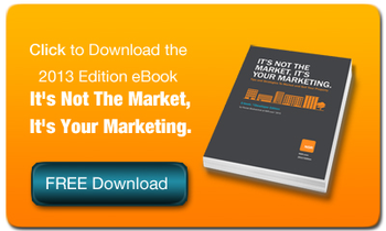
This is a perfect time for N5R to practice what it preaches. N5R CEO, Roman Bodnarchuk, has written a FREE eBook "It's Not The Market, It's Your Marketing." Click below to discover N5R's latest strategies for successful marketing in 2013.
N5R.ai
North America's Leading HubSpot AI Agency
AI Strategy • HubSpot AI • Agent Architecture • AI Transformation
N5R.ai •
WisdomClone.ai •
10X AI News •
Strategic AI Coach
