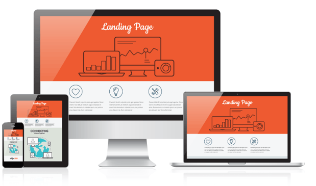
To maximize the conversion potential of your landing page, it’s a common best practice in the industry to use an image. It’s a good suggestion. If nothing else, a wall of text without any visual imagery can make for a pretty boring and poor performing landing page. But why do we actually want to use images for communication?
Why we use images on a landing page
Neuroscientists at MIT found that humans can process and identify an image in as little as 13 milliseconds, whereas previous research had suggested that the quickest time in which an image could be identified was in 100 milliseconds.
It’s not merely that our brains process images at a lightning speed, we’re also making decisions quickly. Consider that the average visitor is spending less than 15 seconds on a website. More specifically, if your visitors are spending less than 15 seconds on your landing page, then capturing their attention is of paramount importance.
As you work to determine the right image for your landing page, keep the following concepts in mind in order to have your image work to drive conversions, rather than driving your visitors away.
Visual storytelling for a concept
As the old adage goes, “A picture is worth a thousand words.” When describing a complex system, process or a brand-new object or idea, a visual representation might explain it best. For example, a diagram is a concise way to describe how a car engine works or an intangible concept such as how cloud computing allows for the transfer of files across the Internet.
Companies continue to create new products and develop things that people didn’t know that they needed or wanted. When you are tasked with promoting the only product of its kind on the market, you might need to show your visitors what it is and why they need it. Can you imagine trying to describe a microwave to a person who was born before humans were able to harness electricity? It would be a bit difficult to describe if you were to communicate solely with words.
When selecting an image for your landing page, use infographics, charts and diagrams when explaining new ideas or complex concepts to your website visitors so that they can swiftly grasp the idea and hopefully, convert on the landing page.
Directing and influencing the conversion
Using arrows on your landing page can allow you to literally direct traffic on your landing page. Having an arrow pointing towards specific areas of your copy or to the form on your landing page can allow your visitors to think less and simply follow instructions.
Another way to use imagery to direct traffic is through visual cues. Whether you use a photo of a person holding a product and looking directly at it or more subtly a person looking in a certain direction. Instinctively, when we see people looking in a certain direction, we want to follow their gaze and see what has their attention.
By using an image of a person looking in the direction of your form on the landing page, provided that it is logical (and relevant) for a person to be in the image, you can subtly place emphasis on different elements of your landing page and direct attention to the form.
Emotional decision-making
Antonio Damasio, a renowned neuroscientist, has been studying the connection between consciousness and emotion for several decades. Damasio’s research shows that emotions play a large role in how we arrive on a decision. How does this help marketers in creating a landing page?
By using images that not only appeal to your visitors but also elicits an emotional response, you may be able to increase your conversion rate. If you are able to bring about a sense of urgency (to act now!) or a feeling of happiness and relief (that a visitor’s issue is being solved), then you might experience higher conversion rates.
How to know if you have the perfect landing page image
Numbers don’t lie. Check out your conversion rates to see how the landing page is performing. An optimized, high performing landing page has a conversion rate of 20% (or higher) of the total number of views converting and filling out the form on the landing page. If the conversion rate is less than stellar, there are many elements that come into play when assessing the overall page. So, the best way to hone in on your image is to do some A/B testing and try different images on your landing page to see which resonates more with your visitors and ultimately converts more visitors into leads.
In just a couple of days of this proven, structured, training - sessions can help any size team meet their sales goals for continued company growth. Backed by knowledge that has helped Roman oversee $5 Billion dollars of real estate sales around the world, imagine how your team would benefit!
Visit N5R.COM for more information.

